How to Create Retina Screenshots with Device Scale
Learn how to generate sharp Retina and HiDPI website screenshots by setting device_scale, while keeping the same CSS viewport and responsive layout.

A regular screenshot uses one image pixel for each CSS pixel in the browser viewport. That is fine at its native size, but text, icons, and fine UI details can look soft when the image is displayed on a Retina or other high-density screen.
ScreenshotCenter's device_scale parameter changes that pixel density. Set it to 2 to render two output pixels along each axis for every CSS pixel. The page keeps the same layout, but the resulting bitmap has four times as many pixels.
The quickest Retina screenshot
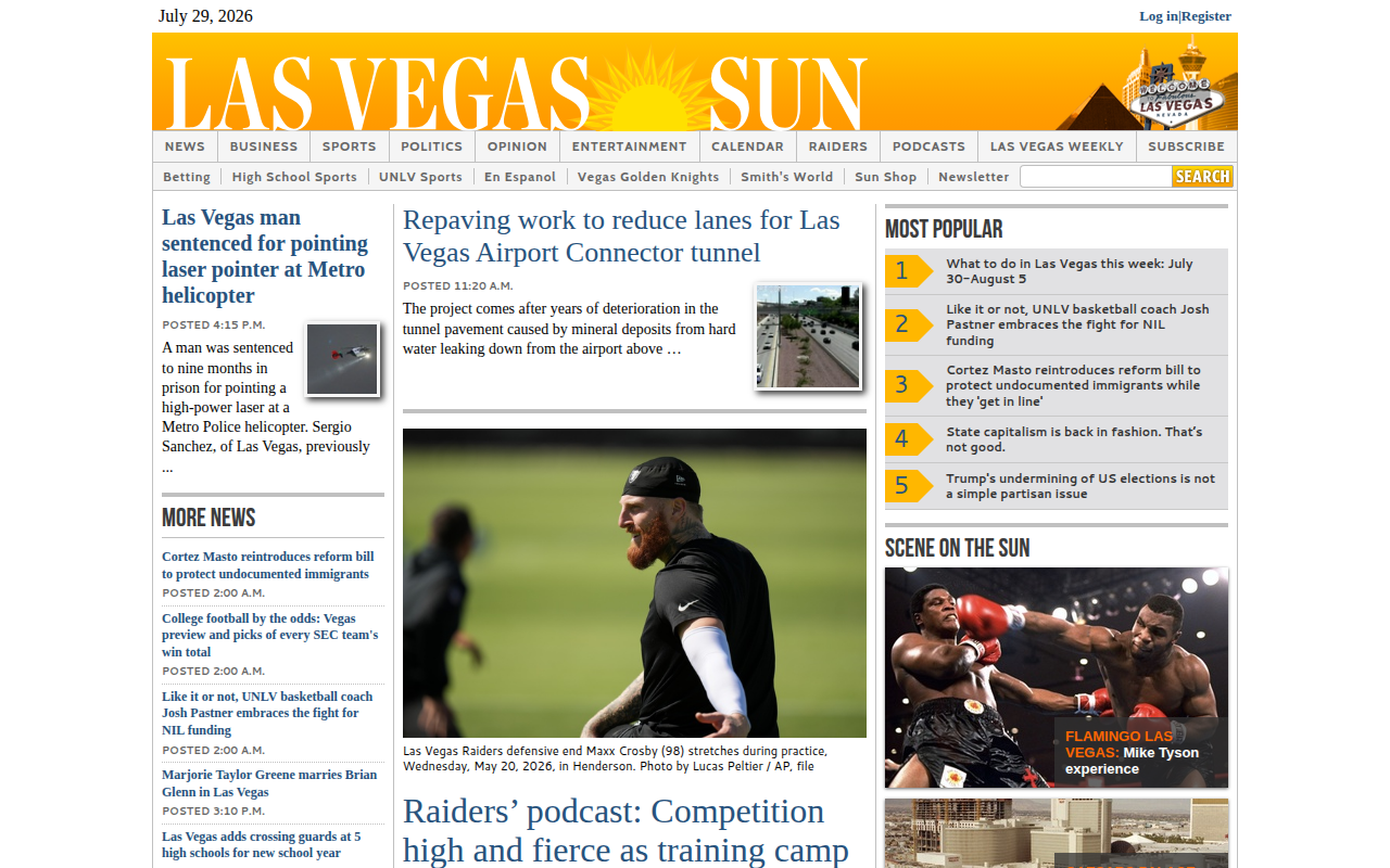
This request captures a 1280 × 800 CSS-pixel viewport at a 2× device scale:
curl --get "https://api.screenshotcenter.com/api/v1/screenshot/create" \
  -H "X-API-KEY: YOUR_API_KEY" \
  --data-urlencode "url=https://example.com" \
  --data-urlencode "size=screen" \
  --data-urlencode "screen_width=1280" \
  --data-urlencode "screen_height=800" \
  --data-urlencode "device_scale=2"
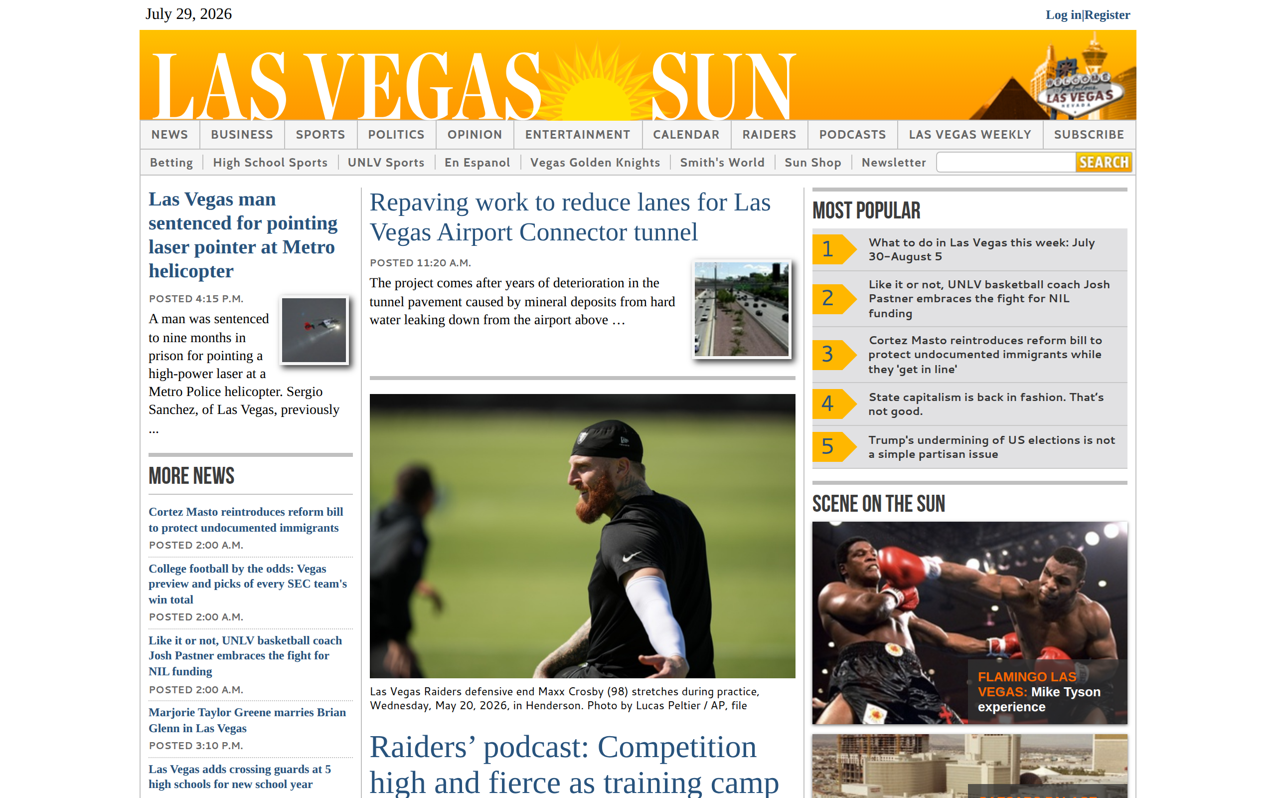
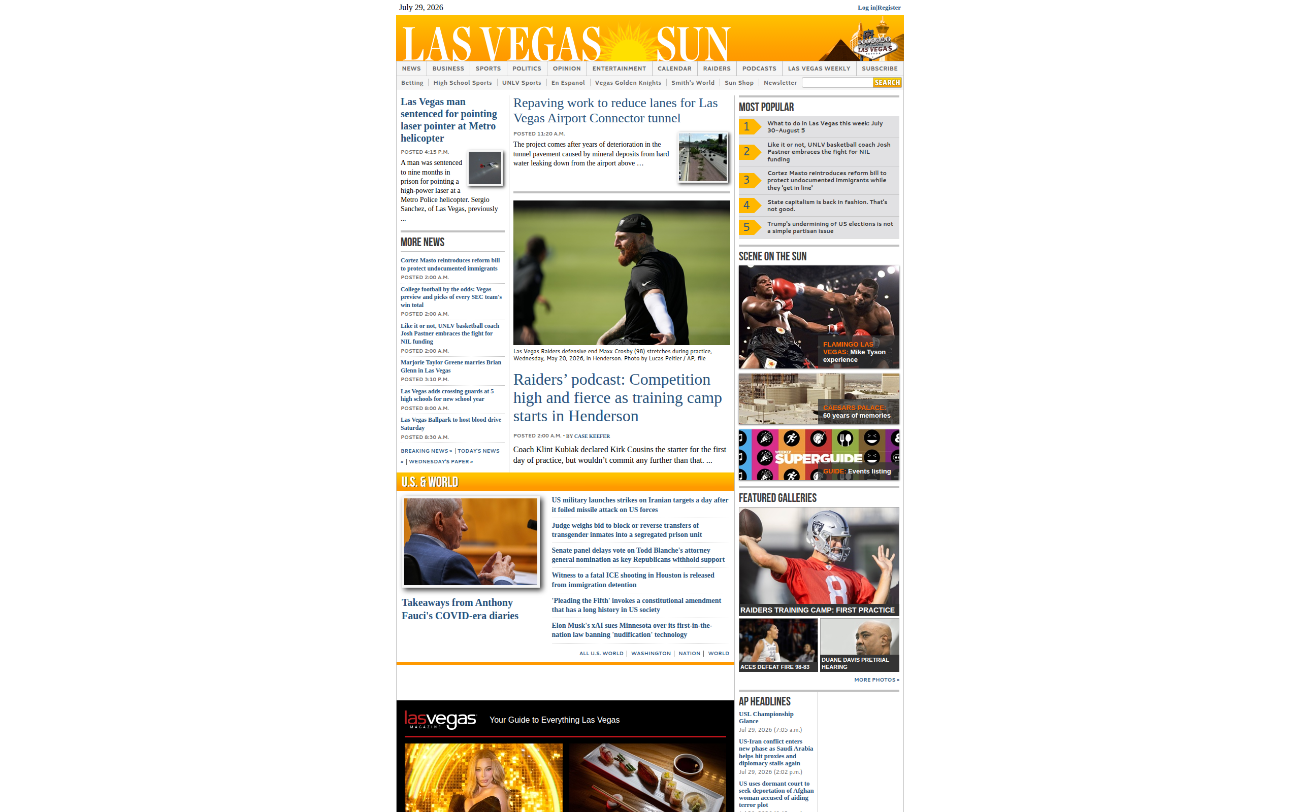
The browser still lays out the page in a 1280 × 800 CSS-pixel viewport. The downloaded image is 2560 × 1600 physical pixels.
What device scale changes
Device scale is the browser's device pixel ratio. It increases the resolution of the captured image without making the responsive layout behave as if the browser were wider.
| CSS viewport | device_scale | Output bitmap | Typical use |
|---|---|---|---|
| 1280 × 800 | 1 | 1280 × 800 | Standard-resolution screenshots |
| 1280 × 800 | 2 | 2560 × 1600 | Retina/HiDPI screenshots |
| 1280 × 800 | 3 | 3840 × 2400 | Very dense displays or extra cropping room |
The formula is straightforward:
output width  = screen_width  × device_scale
output height = screen_height × device_scale
For a full-page capture with size=page, the width follows the same rule. The height depends on the rendered document height and is multiplied by the scale as well.
Why the page layout does not become desktop-wide
It is tempting to request a 2560-pixel-wide viewport to get a 2560-pixel image. That is not equivalent to a Retina screenshot. A 2560 CSS-pixel viewport can trigger different responsive breakpoints, create longer lines of text, and rearrange the page.
With screen_width=1280&device_scale=2, CSS media queries still see a width of 1280 pixels. Chromium simply paints the final image at twice the density. This preserves the intended composition while producing a sharper asset.
Thumbnail example placeholder: add a zoomed crop of text or a small icon at 1× and 2× to show the difference in edge detail.
Choosing between 1×, 2×, and 3×
- Use 1× when file size and transfer speed matter more than extra detail.
- Use 2× for most marketing images, documentation, client reports, and thumbnails displayed on modern HiDPI screens.
- Use 3× for mobile-device fidelity or when you plan to crop and resize the image later.
A 2× image contains four times the pixels of a 1× image, while a 3× image contains nine times the pixels. Larger images require more storage, bandwidth, and image-processing time, so the highest scale is not always the best choice.
Display the 2× image at its CSS size
To get the visual benefit of Retina output on a web page, display the 2560 × 1600 image at 1280 × 800 CSS pixels. The browser can then use the extra source pixels on a high-density display:
<img
  src="/screenshots/example-2x.png"
  width="1280"
  height="800"
  alt="Retina screenshot of the example page"
>
For responsive images, a srcset lets the browser choose the appropriate density:
<img
  src="/screenshots/example-1x.png"
  srcset="/screenshots/example-1x.png 1x,
          /screenshots/example-2x.png 2x"
  width="1280"
  height="800"
  alt="Screenshot of the example page"
>
Thumbnail example placeholder: add the final thumbnail rendered at the same on-page dimensions from both 1× and 2× source files.
Using device scale with a mobile viewport
You can combine a custom mobile viewport with a high device scale:
curl --get "https://api.screenshotcenter.com/api/v1/screenshot/create" \
  -H "X-API-KEY: YOUR_API_KEY" \
  --data-urlencode "url=https://example.com" \
  --data-urlencode "screen_width=390" \
  --data-urlencode "screen_height=844" \
  --data-urlencode "device_scale=3" \
  --data-urlencode "device_mobile=true" \
  --data-urlencode "device_touch=true"
This produces a 1170 × 2532 bitmap while the page uses a 390 × 844 mobile layout.
Do not combine a preset device with a custom scale
A device_name preset already defines its viewport, device scale, mobile mode, and touch behavior. When a valid preset is selected, those preset values take precedence over custom device_* parameters.
If you need an exact custom scale, leave device_name unset and provide screen_width, screen_height, and device_scale yourself. See the device emulation guide for preset and custom-device details.
Practical recommendations
- Choose the CSS viewport based on the layout you want to capture.
- Start with
device_scale=2for Retina-quality output. - Keep the displayed dimensions equal to the original CSS viewport.
- Use 3× only when the extra pixels have a clear downstream purpose.
- Compare the final assets at their real display size, not only while zoomed into the source files.
Create your own Retina screenshot
Open the ScreenshotCenter dashboard, choose your viewport, and set Device scale to 2. Or use the API example above to add sharp, repeatable HiDPI captures to your application.